 |
| Number of Fast Food outlets normalised to 100,000 population for Local Authorities in England Source: Food Hygiene Rating Scheme (Takeaway class) |
I already had a complete set of FHRS data for September 2016. I needed to download various administrative and census geographies, population figures for Lower Layer Super Output Areas (LSOAs), Index of Multiple Deprivation (IMD) Scores for LSOAs and various files showing the linkages between the geographies.
A certain amount of data wrangling was needed to merge this data (for instance linkages, population and IMD) all came in spreadsheets with awkward column names, multiple sheets and other minor inconveniences. Once these were sorted out I had a table with base figures at LSOA level which could be readily aggregated to Middle Layer Super Output Areas (MSOAs) and local authorities. The IMD score is rebased by summing LSOA scores multiplied by population and then dividing by total population.
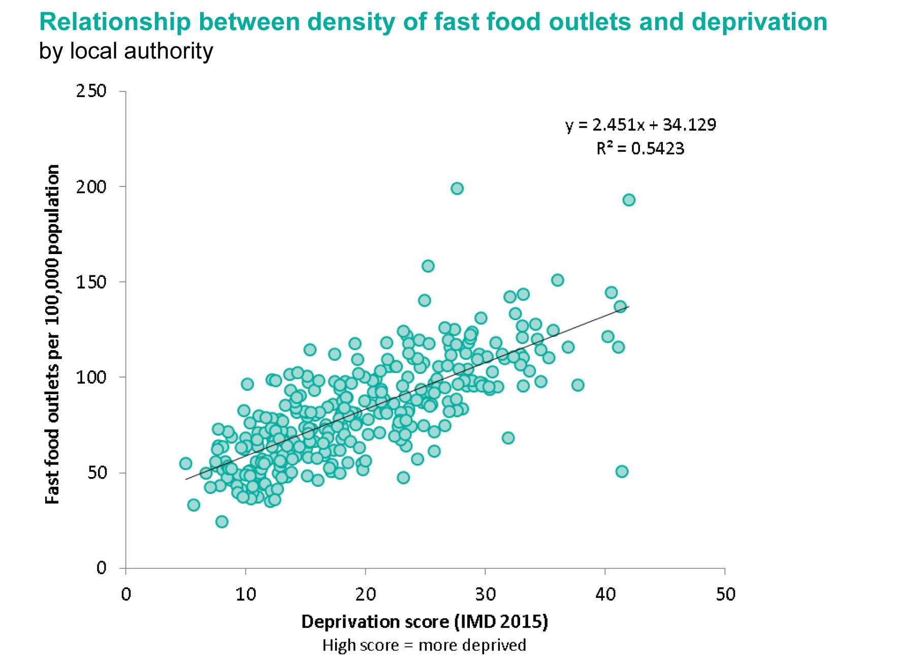
Using R I constructed simple scatter plots with a regression line and 95% confidence limits for both MSOA and Local authorities.
 |
| Number of Fast Food outlets (normalised) vs calculated Index of Multiple Deprivation for Middle Super Output Areas |
 |
| Number of Fast Food outlets (normalised) vs calculated Index of Multiple Deprivation for Local Authorities (outlier of City of London excluded) |
For comparison the relevant plot from the PHE report is shown below:
 |
| Scatter plot from PHE report for Local Authorities |
The final comparison I made was perhaps one I should have done at the outset. Comparing raw counts of fast food outlets from the Open Data source (FHRS) and the PointX data. PHE provided a table of counts at ward level. It took me a while to find a shape file and codes which fitted (the codes change year-on-year), but then it was easy to do a Point-in-Polygon count of the FHRS data for a direct comparison. The correlation of values was plotted in R again.
 |
| Comparison of number of Fast Food outlets by 2015 ward boundaries derived from Food Hygiene Data or from Landmark/Ordnance Survey |
Doing this took longer than I hoped: but almost entirely because I don't know my way around the various formats of boundary data related to the census and more changeable boundaries such as the wards.
I haven't done a formal comparison of the outputs, but the visuals presented above strongly suggest that FHRS data is just as useful as the PointX data for this purpose. The main explanation for the lower count coming from FHRS is that the PointX data includes outlets which do food delivery which may include places classified as Restaurants in FHRS.
I had expected more issues with FHRS because there is clearly an under-reporting issue in inner city areas due to rapid turnover of management of takeaways (see the recent Guardian article for an in-depth appreciation of this issue). The other week at the London OpenStreetMap pub meeting in Islington I insisted that we should check the 'scores-on-the-doors' before choosing where to eat our Burritos (a habit I've learnt from Dr Sian Thomas). The three fast food outlets next to the pub didn't feature at all on the FHRS data.
In conclusion: now that FHRS data covers nearly every major authority in the country (Rutland were the last still hold out) it is entirely suitable for a range of statistical purposes.
No comments:
Post a Comment
Sorry, as Google seem unable to filter obvious spam I now have to moderate comments. Please be patient.