Monday, 24 October 2016

Using Open Data for Statistical Purposes

A tweet by Owen Boswarva drew my attention to a recent report by Public Health England (PHE) on the correlation of density of fast food outlets and deprivation.

Number of Fast Food outlets normalised to 100,000 population for Local Authorities in England
Source: Food Hygiene Rating Scheme (Takeaway class)
Specifically my interest was directed at the source of fast food outlet counts. PHE used data from PointX, a joint venture of Landmark Information and the Ordnance Survey. I instantlly wondered if one could do the same thing with Food Hygiene Ratings (FHRS) open data. This is a quick report on doing exactly that.

I already had a complete set of FHRS data for September 2016. I needed to download various administrative and census geographies, population figures for Lower Layer Super Output Areas (LSOAs), Index of Multiple Deprivation (IMD) Scores for LSOAs and various files showing the linkages between the geographies.

A certain amount of data wrangling was needed to merge this data (for instance linkages, population and IMD) all came in spreadsheets with awkward column names, multiple sheets and other minor inconveniences. Once these were sorted out I had a table with base figures at LSOA level which could be readily aggregated to Middle Layer Super Output Areas (MSOAs) and local authorities. The IMD score is rebased by summing LSOA scores multiplied by population and then dividing by total population.

Using R I constructed simple scatter plots with a regression line and 95% confidence limits for both MSOA and Local authorities.

Number of Fast Food outlets (normalised) vs calculated
Index of Multiple Deprivation for Middle Super Output Areas

Number of Fast Food outlets (normalised) vs calculated
Index of Multiple Deprivation for Local Authorities
(outlier of City of London excluded)

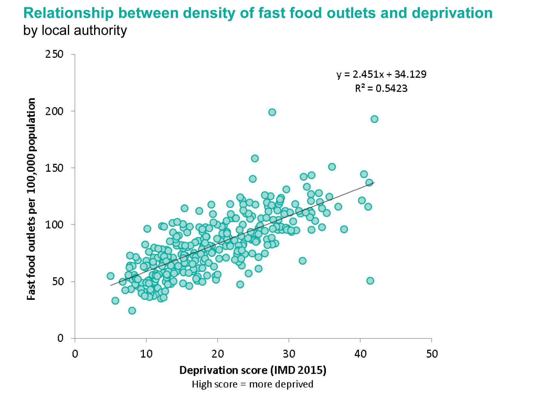
For comparison the relevant plot from the PHE report is shown below:

Scatter plot from PHE report for Local Authorities

The final comparison I made was perhaps one I should have done at the outset. Comparing raw counts of fast food outlets from the Open Data source (FHRS) and the PointX data. PHE provided a table of counts at ward level. It took me a while to find a shape file and codes which fitted (the codes change year-on-year), but then it was easy to do a Point-in-Polygon count of the FHRS data for a direct comparison. The correlation of values was plotted in R again.

Comparison of number of Fast Food outlets by 2015 ward boundaries
derived from Food Hygiene Data or from Landmark/Ordnance Survey

Doing this took longer than I hoped: but almost entirely because I don't know my way around the various formats of boundary data related to the census and more changeable boundaries such as the wards.

I haven't done a formal comparison of the outputs, but the visuals presented above strongly suggest that FHRS data is just as useful as the PointX data for this purpose. The main explanation for the lower count coming from FHRS is that the PointX data includes outlets which do food delivery which may include places classified as Restaurants in FHRS.

I had expected more issues with FHRS because there is clearly an under-reporting issue in inner city areas due to rapid turnover of management of takeaways (see the recent Guardian article for an in-depth appreciation of this issue). The other week at the London OpenStreetMap pub meeting in Islington I insisted that we should check the 'scores-on-the-doors' before choosing where to eat our Burritos (a habit I've learnt from Dr Sian Thomas). The three fast food outlets next to the pub didn't feature at all on the FHRS data.

In conclusion: now that FHRS data covers nearly every major authority in the country (Rutland were the last still hold out) it is entirely suitable for a range of statistical purposes.

Friday, 7 October 2016

Skeletons in the Water

For a number of years now I have, from time-to-time, made the odd stab at trying to find the flowline of a river from the mapped surface area of the watercourse using OpenStreetMap data.

Windermere Lake District from hill
Windermere in the English Lake District, one of my test cases.
I not infrequently find, being neither trained as a geospatial specialist nor a mathematician, that, although I have a fairly clear idea of what I want to do with some particular manipulation of geodata, I am stymied. More often than not this is simply because I don't know the most widely used term for a particular technique. It was therefore really useful to learn from imagico that the generic term for what I was trying to do is skeletonisation. (I do hope my relative ignorance is not on this scale.)

Armed with this simple additional piece of knowledge immediately opened out the scope of resources available to me from wikipedia articles, blog posts, to software implementions. Unfortunately when I first tried to get the relevant extensions (SFCGAL) installed in PostGIS I was not able to get them to work, so I shelved looking at the problem for a while.

Very recently I re-installed Postgres and Postgis from scratch with the latest versions and the SFCGAL extensions installed fine. So it was time to re-start my experiments.

Once I was aware of skeletonisation as a generic technique I also recognised that it may be applicable to a number of outstanding issues relating to post-processing OpenStreetMap data. Off the top of my head & in no particular order these include:

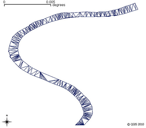
Wiggly River Trent
My earliest experiment using Ordnance Survey Open Data for the River Trent
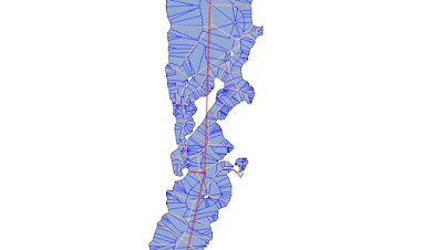
Voronoi triangles based on modes of polygon, clipped back to polygon

  • Waterway flowlines. Replacing rivers mapped as areas by the central flowline where such a flowline has not already been mapped. Such data can then be used for navigation on river systems or for determining river basins (and ultimately watersheds/hydrographic basins). (It is this data which much of the rest of the post is concerned with).

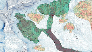
  • Earlier experiments with OpenStreetMap glacier data for the Annapurna region
    Height (contours) & slope(shading) data via Viewfinderpanorams.com
    Voronoi triangulation clipped to glacier used to try & find flowlines for the main Annapurna Glacier.
    Some ideas originated from conversations with Gravitystorm.
    Map data (c) OpenStreetMap contributors 2014.
  • Glaciers. Similarly for rivers although height also needs to be factored in. The idea is not just to identify flows on a glacier, but also simulate likely regions of higher speed flow with a view to creating an apparently more realistic cartographic depiction of the glacier. (Only apparent because in reality one needs lots of good aerial photography to correctly map ice-falls, major bergschrunds, crevasses, crevasse fields etc.).
  • Creating Address Interpolation lines.  A small subset of residential highways have quite complex structures and therefore it is non-trivial to add parallel lines for address interpolation. Buffering the multilinestring of the highway centre lines & then resolving that to a single line would help. (More on this soon).
  • Dual Carriageways. Pretty much the same issue as above except there is the additional problem of pairing up the two carriageways. Resolving them to a single way would make high-level routing and small scale cartography better (i.e., it's a cartographic generalisation technique).

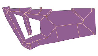
  • The straight skeleton of Old Market Square Nottingham which allows routing across and close to most of the square
    The skeleton does not take account of some barriers on the square,
    but the hole at the left (a fountain shows the principle).
    Data source: (c) OpenStreetMap contributors 2015.

  • Routing across areas for pedestrians. Pedestrian squares, parks car parks etc. Skeletonisation of such areas may offer a quick & dirty approach to this problem.
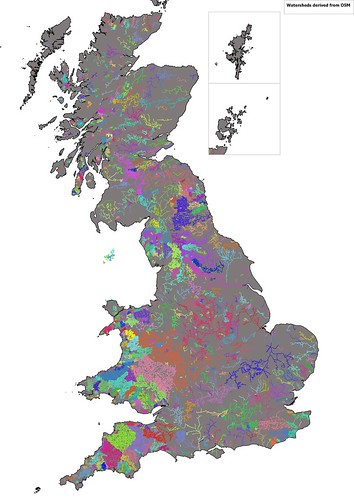
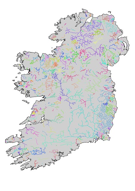
What follows are some experiments I've done with water areas in Great Britain. I have mainly used the ST_StraightSkeleton function, with rather more limited time spent looking at ST_ApproximateMedialAxis. The two images below show my initial attempt to find hydrographic basins: this works merely by chaining together continuous waterway linestrings. These results are not bad, but several major rivers are divided into multiple watersheds. The map of Ireland shows the problem better because the Shannon system appears as a number of discrete watersheds, largely because the Shannon flows through a number of sizeable lakes. Other major rivers illustrating the issue in the UK are the Dee, Trent and Thames.


River Systems of Great Britain (derived from OSM)
Identification of watersheds in Great Britain by contiguous sections of waterway in OpenStreetMap

Irish Watersheds from OpenStreetMap
Watersheds in Ireland derived from linear watercourses on OpenStreetMap.
Waterways are generally less well-mapped in Ireland, but also several major waterways pass through large lakes (e.g., the Bann (Lough Neagh), Shannon (Lough Ree, Lough Derg), and the Erne (Upper & Lower Lough Erne)) and no centre line is available.
So the naive approach raised two problems:
  • Lakes, rivers mapped as areas etc also needed to be included in creating the elements of the watershed
  • Actual watersheds can be created by creating Concave shells around their constituent line geometries. Unfortunately I get a PostGIS non-noded intersection error when trying this, so wont discuss it further (although if someone can walk me through how to avoid such problems I'm all ears). As later versions of PostGIS seem more robust I return to this later.
Of course the simple way to address the first one is just to include areas of water as additional objects in the chain of connected objects. However I would also like to replace rivers as areas, and smaller lakes with linestrings as this type of generalisation can greatly assist cartography at smaller scales. The lack of a source of generalised objects derived from OSM has been a criticism of its utility for broader cartographic use, so this is another aspect of this investigation.

So now with skeletonisation routines working in PostGIS time to look at some of the basics.

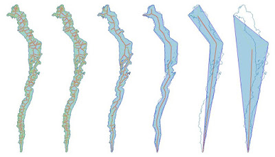
I've taken Windermere, the largest lake in England, as an example to work through some of the issues. Windermere is a long thin lake which should have a fairly obvious median line. However, it does have some islands which complicate the matter.

Six versions of Windermere showing area, media axis (red), straight skeleton (thinner lines)
for different degrees of simplification (parameters of 0,5,25,125..).
Original shape is shown as a blue outline.`
All created as a single query using st_translate.
Both the straight skeleton & the medial axis are complicated multi-linestrings if I use raw OSM data for Windermere. Progressive simplification of the shape reduces this complexity with reasonable desirable medial axis appearing when simplified with the parameter of around 100 (assumed to be meters in Pseudo-Mercator). Unfortunately there are two problems: the derived axis passes through large islands; and inflow streams are not connected.

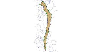
I therefore took a different approach. I disassembled Windermere using ST_Dump and cut the line forming the outer ring at each point a stream or river way touched the lake. I then simplified each individual bit of shoreline between two streams & then re-assembled the lake.

When this is done all inflows & outflows are connected to the straight skeleton of the simplified lake area. This can be input directly into my routines for collecting all ways making up a watershed.

Additionally the straight skeleton can be pruned. The simplest one is to just remove all individual linestrings which dangle (i.e., are not connected to a waterway). Presumably one can iterate this until one has the minimum set necessary to a connected set of flows, but I haven't tried this.

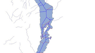
Straight Skeletons for Windermere calculated for different simplification parameters.
The grey lines represent a parameter where details of islands are kept but the number of edges in the skeleton is greatly reduced.

Windermere showing inflow & outflow waterways

Detail of the centre of Windermere showing a reduced straight skeleton linked to inflowing streams (blue). The equivalent without reassembly and preserving stream topology is in red
For a single lake it is possible to determine the appropriate degree of simplification to apply, but the complete set of lakes & ponds in Great Britain is a completely different matter.

Over simplification will result in too big a discrepancy between the original shape and adjacent geometries. Even for Windermere trying to include islands in a reassembly fails with too great a degree of simplification because geometries now cross each other.

My approach has been to simplify geometries with parameters from 50 to 250 metres in ST_Simplify. I then compare a number of factors with the original:
  • Do I get a valid geometry
  • Number of interior rings
  • A measure of surface area
With these I then choose one of the simplified geometries for further processing. In general large lakes and riverbank polygons will tolerate more simplification. The overall result is less complicated straight skeletons for further processing. (As an aside I think Peter Mooney of Maynooth did some work on comparing lake geometries using OSM data around 2010 or 2011).

For my immediate practical purposes of finding watersheds I did not perform further pruning of skeletons, but such a process is needed for other applications such as cartographic generalisation.

Even with my first approach which I thought was fairly robust I'm losing a fair number of  waterways with simplification. I haven't looked into this further because it will delay finishing this particular post: and it's been on the stocks long enough.

For further posts on the problems of skeletonisation read Stephen Mathers blog which I found very useful. StyXman is developing a JOSM plugin which uses some of these techniques to create centrelines too. A big thank you to him, and, of course, to Christoph Hormann (imagico).

Friday, 1 July 2016

How far are Hedgehogs from a road?

My last hedgehog siting (2010)2887a
My last hedgehog sighting in Britain: Elston, Nottinghamshire 2010.


One of my great joys with OpenStreetMap (and other (mainly) geographical Open Data) is that it provides a way into answering intriguing analytical questions.

A few weeks ago the query was from a Hedgehog ecologist: naturally I learnt of the query through OSM (via IRC to be precise).

The question was very simple:  

What proportion of Britain's land area is more than 100 m from a road?  

The reason it is germane for hedgehogs is that historically they have had a very high mortality from crossing roads. These days they are so rare, that spotting a squashed hedgehog is itself a rarity. Certainly this cartoon would not have the same resonance it did when it first appeared in the 1970s.

To answer the query is fairly straightforward: providing one has either a GIS tool or database to hand AND a full data set of British roads. QGIS and PostGIS were available & I also have a full set of OSM data for May 2015 in the latter.


Friday, 20 May 2016

Bristol (& New Brighton) Buildings from Lidar

West front of Bristol Cathedral
West Front, Bristol Cathedral
One of the buildings where we could use Lidar data to enhance its representation in OSM
At OpenData Camp 3 over the weekend I asked John Murray if he could give me a set of polylines extracted from the Environment Agency Lidar Open Data. Do read John's amazing post about the tools he has built for doing nifty things with Lidar data: Turning Lidar Data into Actionable Insight.

I thought if might be a bit of fun to actually show directly how opendata produced by one of the ODCamp sponsors might end up in OpenStreetMap.

In practice John got keen over the lunch break and wrote a bit of code to turn his polylines into polygons. So just before the last session of the day kicked off I had been sent a shape file for the 1km Ordnance Survey gird square where the meeting was taking place.

We had one initial teething problem that the data was out by 1 km, but notwithstanding that it was very simple to perform some simple manipulations in the off-line OpenStreetMap editor JOSM.

JOSM can read shapefles (and some other geo-formats such as geojson too) and automatically transforms these into OSM elements projected in WGS84. Therefore the additional data manipulation steps were pretty trivial:
  • Select all way elements (using a type:way search)
  • Add a source=EA Lidar Open Data tag
  • Select all type:relation elements to find multipolygons
  • Add building=yes tag
  • Select all way elements which were not part of multipolgons (type:way and not child type:relation)
  • Add building=yes tag
  • Select all way elements again and simplify them.
 The image below shows how this looks in the editor


Now this is all pretty amazing, and if you read John's blog post there's lot more info which can be gleaned. However a close inspection of the data still shows a sizeable number of artefacts which would need cleaning up. Some John has dealt with in the intervening few days, but turning any automatically extracted feature into something of the sort of quality which can be one in OSM is another matter: and is not too dissimilar to the points I made some time ago about OpenMap Local.

For me the real advantage is that it's a major step in making if more feasible to use Lidar data to enrich OSM data. For instance data on roof orientations could be combined with the algorithms & crowd-sourced validation methods from OpenSolarMap. I hadn't realised until listening to John's talk just how valuable gable or eaves heights are in building datasets. It certainly persuaded me that they belong in OSM.

Another downside is that it takes a whiz like John to create this software and it makes use of a powerful machine, powerful algorithms, optimised hardware & proprietary storage. I have therefore spent a little time this week looking again at what is available in QGIS to do similar (but much less powerful) manipulation of the Lidar data.

Basic transformations of Lidar have been described elsewhere (for instance see Chris Hill's posts) so I won't dwell on them here. Suffice it to say I presume that the following have been created for a given area:
  • Combined Digital Surface Model (DSM). I usually do this as a virtual time set (can be done directly in QGIS)
  • Combined Digital Terrain Model (DTM). As above.
  • Delta of the two. DSM-DTM. This gives things (buildings, cars, trees etc) which are elevated above ground level.
To get somewhere near what John's approach involves ideally requires:
  • Filtering out shorter objects (mainly cars, garages & some street furniture)
  • Filtering out smaller objects (mainly trees)
  • Edge detection
  • Polygonisation
In practice I found it relatively easy to do the first & last and did not find a simple way of doing the other 2 in QGIS (although in part that might be because I'm short of disk right now).

The other two can be achieved easily:
  • Filtering by Height: this is merely another raster calculation using the QGIS Raster Calculator. In my test area (New Brighton on the Wirral, OS grid ref SJ3093) most houses are Edwardian and much higher than 3 metres, whereas garages are usually a touch over 2 metres. I therefore used 3 metres as a cut-off.
  • Polygonisation. I used the height filtered data directly with the Raster...Conversion...Polygonize option in QGIS. This is a much cruder and more naive method than I was hoping to use, but there it is.
I show the results of these steps below (in separate images to allow easier inspection & then combined).

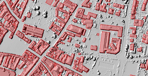
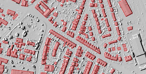
Lidar Height data (DSM-DTM) filtered for >3m

Extracted & OSM Building polygons compared
(garages are deliberately excluded from OSM data)
Height data combined with Polygons


Firstly it's worth noticing a few features from the raw height data:
  • Most buildings are tall, usually in excess of 8 metres (and probably at least that height at the gables).
  • There are a limited number of lower height buildings. The most obvious ones are near the top of the image and include two small factory premises N of the railway & the platform canopy of the railway station. S of these the road bridge over the railway is obvious; and immediately to the SE there are apparently two largish buildings of low height, albeit quite a bit of noise in the height profile. (These are, in fact, Victoria View a development of flats which halted for several years). Further S still there are a small number of bungalows.
  • Terraces with a lower rear service area are obvious.
  • There are a significant number of linear features above 3 m in height. Most look to be walls, and indeed garden walls in the area tend to be high as most gardens are small & given building heights would tend to be overlooked.
  • Isolated trees are obvious in one or two back gardens
  • Larger groups of trees are equally obvious along the railway line (& elsewhere)
  • Swirly patterns in the 3-4 metre range occur in a number of places. These are mainly scrub (mainly gorse) or shrubberies.
  • There are still parked vehicles giving returns in the 3-4 metre height range. 

Edwardian Streets S of Mount Road New Brighton (Dovedale & Langdale Rds)

I include a couple of photos of streets in the area to help with context. I would recommend strongly Russ Oakes' work documenting suburban streets all over Merseyside for a much broader perspective.
Junction of Dudley & Hamilton Roads, New Brighton

Comparing the extracted polygons with OSM (and ignoring some OSM data which is missing) shows:
  • There is a fairly constant offset of OSM data (presumably inherited from the Bing imagery).
  • Building footprints are broadly comparable
  • Small gaps in terraces are resolve much better by tracing.
  • Some detail has not been added to some of the terraces in OSM which are still drawn as plain rectangles.
  • It's certainly possible to spot missing features & use Lidar data as an aid to add them in (notably Victoria View, but the W part of the development was started after the Lidar data.
Now as for deriving data to enhance OSM there's a fair more bit of processing needed.

Absolute building height is relatively easy, one just needs to find the maximum height within a (location corrected) OSM polygon. Generating the other more useful Simple 3D building (S3DB) tags is rather more involved, and certainly I have the impression that QGIS would be a fairly clunky way to do things. I really hope that some more technically-minded OSM folk can take inspiration from John's ideas and start thinking about tools to mainpulate Lidar data specifically for OSM.

There is no doubt that the Environment Agency Lidar data was one of the most significant open data releases last year. Furthermore it is likely that other agencies & local government bodies will make Lidar available more widely in the near future. For instance I believe much data from Kanton Zurich is open, including Lidar. This example shows the extensive slumping caused by peri- and post-glacial phenomena in the woods near Bergietikon: so this is a reminder that it's not just buildings which are of interest.

One last thing to note is that there's lots one can do with this data immediately (the subject of John's original article). Working how to add this data to OSM begins to look not dissimilar to creating authoritative datasets. It's of course worth spending time working out how to do this because once in OSM the data is potentially available for a multitude of purposes.

Wednesday, 4 May 2016

Where have all the woods gone from Google Maps?

Very recently there was a nice post by Justin O'Beirne about the cumulative effect of changes to the cartography of Google Maps.  Richard Fairhust summarised his views on twitter:


This is just my (very) minor contribution to the discussion.

The Botanical Society of Britain & Ireland (BSBI) uses Google Maps as the background to their maps of plant distributions. Over the past couple of weeks I've been using it a lot because I've been interested in two things:
  • Where I might fund particular plants relatively close to where I live;
  • Which plants I see might be of interest to the county recorders.
As at this time of year many of the botanical highlights are to be found in ancient woodlands it's damn useful to see where the woods are when assessing the BSBI records. That's why I noticed woods disappearing from the Google cartography as one zooms in.

This screenshots shows successive zooms of an area in central Nottinghamshire which includes Clumber Park an two old woods, Gamston & Eaton Woods. The latter two are centre right above the village of Askham.


All woodland just disappears between these two zoom levels.

Here's the active map so one can play with zooming in & out.


Losing woods at high zoom levels is another example of loss of functionality. In practice it makes the maps layer useless for interpreting botanical data: I have to resort to using the satellite layer. Even that is not always easy because sometimes fields also appear dark green.

Google does use a couple of other green shades for things like parks, golf courses, and possibly nature reserves (see Sherwood Forest NNR near Edwinstowe). I don't know if these come on and off in a similar arbitrary pattern.

Sunday, 14 February 2016

Distribution of Contributions in Volunteer-generated Datasets : Gall or Fruit Fly Records

I remarked in my OpenCageData interview that I see many similarities between biological recording and OpenStreetMap contributions. Indeed, I've had some interesting discussions about this with Prof. Muki Hakaly at UCL. Muki's group now do extensive research across the gamut of activities which fall under the rubric of "citizen science", so I'm hopeful that they will elucidate which features are common across this spectrum.

Chaetorellia jaceae f : 5532b
A female Chaetoraellia jaceae, a tephritid fly whose larvae feed on Knapweed.
Photo: (c) mausboam, Flickr.
Basically, we know that there is a very long tail of smaller contributions to OpenStreetMap. Both Harry Wood and Frederick Ramm gave presentations on aspects of this at SotM-14 in Buenos Aires, and Richard Fairhurst also touched on this at SotM-US in 2013. Very recently Marc Zoutendijk has used data collected by Pascal Neis to examine a cohort of new Dutch OpenStreetMap contributors from 2014 and 2015.

The usual hope expressed by people doing this type of analysis with OSM data is that by better understanding of these contributions we can improve the number of people who continue to contribute after the initial sign-up and first edit.

My perspective is slightly different, because it is coloured by knowledge of the much longer history of biological recording.


Monday, 18 January 2016

UK Open Data and Buildings in OpenStreetMap

I've finally (after 8 months) got around to looking at the OpenMap Local buildings. This new dataset was launched at the first OpenDataCamp, and I've had the SU 100 kilometre square data on the PC since then (it's contains Southampton, where Ordnance Survey are based). I use Meridian 2 OS Open Data regularly and extensively, but these days don't make much use of the larger scale vector data.
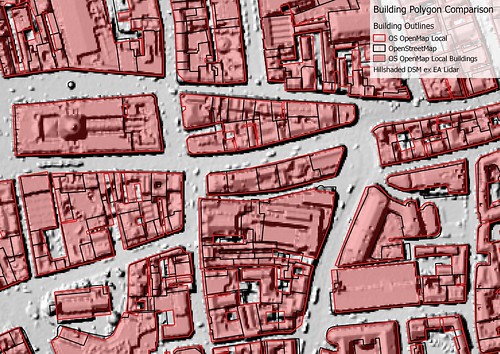
Nottingham City Centre: OSM/OSGB Building Comparison
Comparison of Building polygons for Central Nottingham
OSM has more detail and does not merge discrete buildings.
Contains Ordnance Survey data (c) copyright and database right 2015, OSM data (c) OpenStreetMap contributors 2015, Lidar data from Environemnt Agency under OGL 3.0, (c) Crown Copyright and database right 2015. Image CC-BY-SA, the author.
I needed them for something else which caused me to download the SK data. Co-incidentally Christian Ledermann had asked on talk-gb about using this data to add buildings to OpenStreetMap for Newark-on-Trent. A little earlier the Environment Agency had released Lidar data for England, and this is also useful as input for mapping buildings.

OpenMap Local

Apart from the area I originally needed which were in SK41 (no buildings in OSM), I've also looked at areas which I know much better & compared some selected areas where we have good building coverage around Nottingham. The comparisons I made are shown visually, with my main observations summarised at the end. Note that comparisons have not been made on any systematic basis.
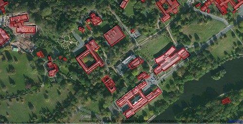
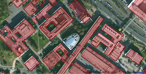
uon_univertiy_park
University Park, University of Nottingham
an area of predominantly large academic buildings.
OpenStreetMap and OS OpenMap are largely in agreement: the minor differences applying to newer buildings which post-date the Bing imagery.
Contains Ordnance Survey data (c) copyright and database right 2015, OSM data (c) OpenStreetMap contributors 2015, Lidar data from Environemnt Agency under OGL 3.0, (c) Crown Copyright and database right 2015. Aerial Imagery via Bing, (c) as in image. Image CC-BY-SA, the author.

uon_science_city_buildings
The Science City part of the University Park campus.
A new large lecture theatre block is not present in OpenMap data, and the outline of the building top centre (Tower Building) is over-simplified.
Contains Ordnance Survey data (c) copyright and database right 2015, OSM data (c) OpenStreetMap contributors 2015, Lidar data from Environemnt Agency under OGL 3.0, (c) Crown Copyright and database right 2015. Image CC-BY-SA, the author.


newark_buildings2
Central Newark. OpenMap vs Lidar.
Many instances of building merging & over-simplification are apparent here, notably with the outline of the parish church.
Contains Ordnance Survey data (c) copyright and database right 2015, Lidar data from Environemnt Agency under OGL 3.0, (c) Crown Copyright and database right 2015. Image CC-BY-SA, the author.

newark_buildings1
Newark-on-Trent, residential areas, Showing inconistency in size for similar houses, and merging of terraced housing.
Contains Ordnance Survey data (c) copyright and database right 2015, OSM data (c) OpenStreetMap contributors 2015, Lidar data from Environemnt Agency under OGL 3.0, (c) Crown Copyright and database right 2015. Image CC-BY-SA, the author.
I have not made systematic comparisons, but these are my main observations (in brackets the 1km grid square where I've noted any particular issue):
  • Best for larger buildings. The data seem much more reliable (actually matching building footprints fairly well) for larger buildings. Even for large detached houses I would regard the data as unreliable: on our road of 40 detached houses, at least 16 are represented as terraces (SK5439). Similar artefacts occur in other areas with detached houses: apparently caused when a garage is close to both houses. Smaller houses are inherently simplified: no better than drawing one in JOSM and then copying the outline in fact.
  • Building fusion. This is particularly clearly seen in the city centre image, where a whole block of buildings has been simplified to a single building (centre of image), but also occurs in suburban housing (see above).
  • Inconsistency in geometry simplification. This is most noticeable in the city centre. (SK5739). For instance compare the OSM and the OpenMap Local outlines for St Peter's Church (bottom right in map above). In OpenMap Local the church is just shown as a rectangle, whereas in practice it is more complex. Modern buildings on the Jubilee Campus of Nottingham University are generally shown with more detail.
  • Inconsistency in building size. In SK5439 there are a very large number of houses which were identical when built. However, in the OpenMap Local they are often of different sizes. (This is also probably true of OSM, if buildings have not been created by duplication).
  • Voids. Gaps between closely packed buildings in the city centre appear slightly arbitrary in both placing and whether such a void exists or not.
  • Some selection inconsistency with small size buildings. Only 2 garages are shown in an area of around 500 houses. With OSM the figure is nearer 200+. (SK5439)
  • Demolished buildings. Whilst I would not expect the data to show the building demolished in the past month, I would expect it to not show one demolished 2 years ago, and I would certainly expect it not to show one demolished in 1970 (although MasterMap shows this too). (SK5439)
  • Better locational accuracy. If using the full transform it may be useful to take advantage of the better locational accuracy of this data. In the main OSM buildings are rarely more than 3 m displaced from the OS OpenMap Local. (SK5439) In general the more recently mapped buildings in Nottingham city centre have better locational accuracy than this (SK5739).
Taken together, my use of this directly within OSM would be along the following lines :
  • Selective transfer of larger buildings (schools, offices, public buildings, factories, warehouses, larger shops) on a case-by-case basis from a shapefile to a JOSM editing layer, or to Potlatch 2. Some minor refinement will probably be needed (for instance a university building here has long narrow courtyards which act as light wells which are not shown in OpenMap Local.
  • Only use it for houses and similar when shapes are very simple and everything has been double checked, at the very least, against aerial imagery. For simple shapes it's as quick to draw & copy in JOSM anyway. A similar principle holds for more complex building shapes on modern estates, where one building can be cloned.
  • Watch out for demolished buildings. This requires not just checking against Bing/MapBox imagery, but some local knowledge for sense checking.

Environment Agency Lidar Data

Another source of building data is the recently released Environment Agency Lidar data. This does not cover the whole country, and in many places may only be at 1 or 2 m resolution. It may also be quite old. However, because it does not suffer from parallax artefacts it can be used in conjunction with both aerial imagery (whether from Bing, MapBox or more local sources) and OS OpenData. I have provided examples from Nottingham, Newark, and Melton Mowbray of this data, combined with one or more of OSM buildings data, OS OpenMap or Bing aerial imagery.
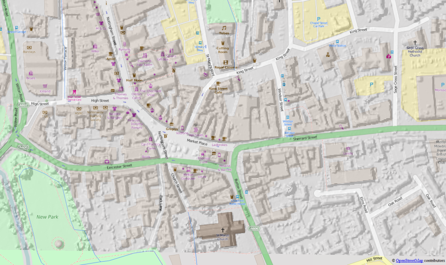
Melton Mowbray. EA Lidar DSM (1m) overlaid on OSM.
The Lidar data was used to refine the OSM building outlines
which originally were traced from OS StreetView as block-sized polygons.
(see commentary)
Melton Mowbray illustrates many of the benefits of Lidar data. It is a fairly typical country town, with many of the buildings in the town centre ranging in age from 10 to 500 years old. Many extend back from the street in a series of outbuildings (e.g., stables) which have eventually been incorporated into the main building, but this process leaves lots of small courtyards, service yards, etc which are more or less impossible to discern on aerial imagery.
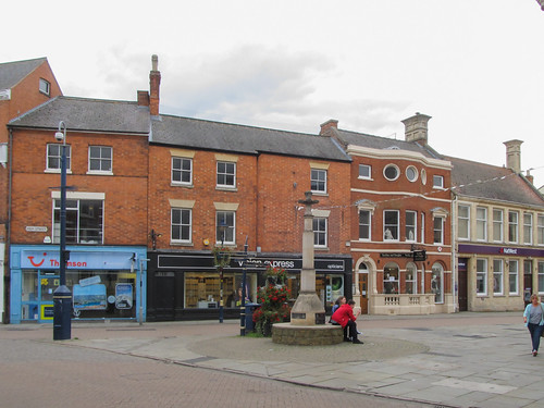
Butter Cross on Market Place, Melton Mowbray
Butter Cross in Market Place, Melton Mowbray
Despite the different styles & ages of the buildings, several have long ranges at the rear.
By doing a street-level ground survey one can identify which buildings are distinct on the street front. Lidar than helps to construct a building outline which is consistent with this. I surveyed the cetre of Melton in September, and this was the first place where I used Lidar data to aid in the interpretation of aerial imagery. In this case I find it essential to have adequate street level pictures to be able to relate to the aerial imagery: most useful are the presence and distribution of chimneys: because they throw shadows they are often visible even on poor quality imagery.

The Lidar data also allows one to do some other things: notably find building heights. I've done this for a 1980's estate on the edge of Maidenhead: particularly easy as the residential buildings fall into a small number of categories: bungalows, two-storey-houses & maisonettes (purpose built flats in a house-like structure.
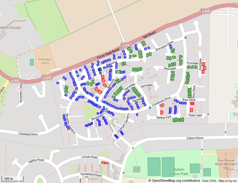
A 1980s housing estate with building heights mapped from English Environment Agency LIDAR Open Data. Buildings fall into 3 height categories: bungalows (green: approx 4m high), 2-storey houses of various kinds (blue: approx 6 m high), and maisonettes (condominiums) which are about 7 m high (red). Heights were calculated in m, so the values represent minimum heights of the highest part of the building, which is nearly always the gable line.
Outpur via Overpass Turbo, styled with MapCSS.
There are many other useful blog posts about using this Lidar data, both specifically for OSM, but also generally. See posts by Chris Hill ("More Lidar Goodness" and "Building Heights") and Ed Loach for some of the specifics, and the write-up on the wiki. A nice post and map (v. slow in my browser) showing building heights in London on OpenMap Local may also be of interest. HousePrices has processed all the Lidar data from EA and Natural Resources Wales  as a hillshaded slippy map which is useful to look at what is available. Slightly unfortunately the map is in OSGB projection (ESPG:27700) and is not shown with other slippy maps which would make it a bit easier to locate oneself.

What kind of building data should be added to OSM?

From past experience single building outlines traced from OS StreetView, turn out to represent tens of buildings on the ground. Such simplified outlines just makes the work of splitting the buildings properly quite a lot harder. This can be particularly bad in town/city centres.

Usually if adding detail of POIs and addresses it is important to have individual buildings mapped: this makes it much easier to correlate photos to roofline features such as chimneys, gables etc. A single very simple outline may be OK, because for more detailed mapping it should just be a question of deleting the original outline. However, the question must be asked, as to what purpose such an outline fulfils on OSM, when the source data can be readily combined with OSM data for downstream consumption.
Granby Street, Leicester (geograph 2296099)
Granby Street, Leicester.
The multiple buildings shown here are represented in OSM as single buildings for each block
(imported from OS StreetView Open Data).
CC-BY-SA   © Copyright Malc McDonald and licensed for reuse under this Creative Commons Licence.
I think the fundamental question about straight imports into OpenStreetMap should be "Will it make life easier or harder for subsequent mappers?".

If the work involved refining a building outline takes longer than re-drawing the building then I doubt if its worth importing the building at all. This is particularly true if the outline is actually of multiple buildings. This is why large building outlines are most valuable: they are generally pretty good compared with what an initial hand-traced outline might look like, and they lend themselves better to stepwise refinement. One group of buildings I find particularly tedious to do well are schools which tend to be a sprawling mass of interconnected buildings. Starting with a decent polygon with orthogonalised angles make adding such detail much easier. The current quarterly project for UK-based mappers might be the time to test this.

Of course it may be that adding buildings assists in some other mapping goal. I've already mentioned that details of buildings are very useful for addresses. However OpenMap Local lacks the detail in precisely the areas where it would be most useful (city & town centres). For suburban or inner-city housing similar polygons can be created as quickly in OSM editors (notably in JOSM, by duplicating existing buildings or using the Terracer (or even UberTerracer) plugins.

The other thing which many people want is rendered maps largely derived from OSM, but showing more buildings. In practice, because many mappers do not have the know-how, wherewithal or time to create such a rendered view, they tend to want to import buildings. Historically, OSM tools for importing data are often much easier to use than ways to incorporate the same data and OSM data to  render maps and make them accessible on the web. Perhaps we need to do more to help people in the latter task: which is now getting more complicated again with the move to vector tiles (at least outwith use of MapBox Studio), and TileMill's effective status of being a legacy application.

Summary 

Sadly, although the new building outlines are better than what preceded them, in most cases they don't offer a decent route for iterative refinement with OpenStreetMap.

This absence of a simple way to improve building outlines means that ideally people wishing to use this data would merge it with OSM data outside of OSM. I do recognise this is often too much work, or too big a learning curve for many, and consequently there will always be a desire to add buildings to OSM because many people are much more comfortable with consuming only OSM data for their purposes.

Existing tools for drawing buildings in OSM are pretty powerful & getting more powerful all the time. Many of us, and I include myself in this group, are unaware of the full extent of these utilities. See bdiscoe's diary post about mass adjustment of circular buildings (huts) for some insights.