 |
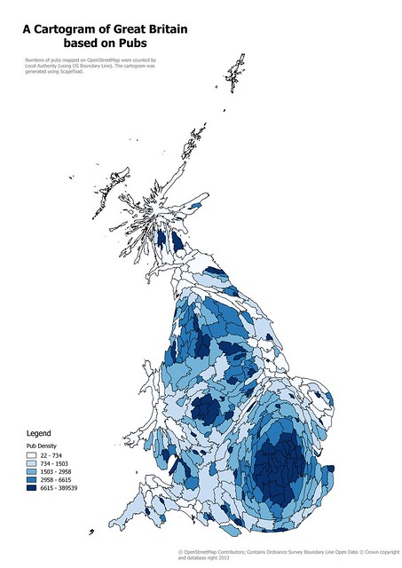
| Cartogram of Local Authority areas in Great Britain based on numbers of pubs on OpenStreetMap Created using ScapeToad, this is a simple, and naive, cartogram. |
Cartograms (again)
Nearly a year ago I attended a London Geomob session at Google Campus. I particularly wanted to hear what Benjamin Hennig had to say about cartograms. In the end the crush in the pub was so big I never got to talk to him, instead I managed to have a long and interesting conversation with another one of the speakers, Jason Davies (known to some for his work on d3js). Much of our discussion was about visualisation techniques (of which more below), but I did manage to get some advice about producing cartograms. |
| Swiss cantons, cartogram by population (this is the demo data set). |
As an aside, I should mention that the first time I came across the idea that simple distortions of a grid could do interesting things was in the work of the Scottish biologist D'Arcy Thompson. He wrote a magnificent book On Growth and Form, published around 1916. This in turn both inspired scientists & mathematicians, such as Alan Turing, Lewis Wolpert and Brian Goodwin, to investigate pattern formation and morphogenesis long before the actual molecular mechanisms were known. In turn Thompson was inspired by renaissance drawings by Dürer (see below: Thompson's drawings are still in copyright).
 |
| Durer's sketches of the relative proportions of the human head. |
Global Retail POIs from OSM
In the meantime I have, from time-to-time, been trying to create a worldwide file of retail POIs from OpenStreetMap. The idea is that the data in such a file should both be enriched and standardised. For the moment I am concerned with very simple enrichments: adding country codes, and grouping retail outlets into a small(ish) number of categories.The basic idea is simple: extract a small number of amenity tag values and all shop tag values from OSM planet files, and then using a point-in-polygon method assign each element to a given country. In practice I have used Geofabrik's continent-wide extracts rather than the whole planet, and all elements have been converted to centroids using osmconvert. Two problems arose in this approach: a) using osmfilter gave inconsistent results; and b) point-in-polygon requires detailed, not generalised country polygons.
I still don't quite know why a given filter spec with osmfilter sometimes works as expected and other times does not, but I have been able to get consistent results using simple filters and using them in sequence.
When I started I deliberately did not use OSM country polygons: mainly because I thought there was a considerable risk that they would be broken. Instead I started with Natural Earth 1:10 million scale shape files. However, these proved to be far too generalised to work: particularly as so many densely populated places lie near a coastline.
My first approach was to buffer these polygons, but it's more complicated to eliminate overlaps. I then buffered NE coastline shape files and combined them with the country files. This fixed coastlines, but then numerous other problems arose where populated places in two countries are close together (e.g., Rhine Valley, Vatican City, etc). At this point I put the work to one side. It should be noted that this experience shows that Natural Earth polygons are not suitable for analytical rather than cartographic applications. I would hope that in the future they might consider maintaining an additional set of vector data for this purpose
Very recently I was made aware of the great work of a group of German mappers who now maintain boundary polygons on OSM. This means that it is now entirely possible to work using the more detailed polygons from OSM for point-in-polygon queries.I was able to extract country boundaries from the Geofabrik continent files, although one or two larger boundaries had to be extracted from OSM directly (presumably because they weren't complete in a single extract file).
Next I gridded the country boundaries so as to create smaller areas for resolving the st_within query. I used a grid of 7.5 degrees square, which works for me. Even with the smaller areas PostGIS queries were taking a long time to run. Rather than simplifying the boundaries I resorted to a cruder technique.
Instead of assigning POIs to a country within the grid, I just assigned them to a latlon grid square. This latter because it is a regular bounding box is a very efficient computation. I then created a cartesian product between the assigned grid square and all country polygons within the grid square. In most cases only a few countries fall within a given latlon square, so the number of comparisons is reasonable. Another way to speed the queries up was to have both the point and candidate polygon geometries in the same row. In other words I used lots of disk space, transient tables, and in-row comparisons to avoid heavy processing of geometry columns. For 3 million POIs this runs in a few minutes, which is fine for my purposes. The end result is a table of the POIs assigned to country.
Cartograms of Retail POIs
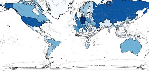
This can be used for many different kinds of visualisation. The first kind I tried was, of course, a cartogram of pubs. For this I could use Natural Earth (NE) boundaries, I just created shape files with a count of pubs by country linked to the NE data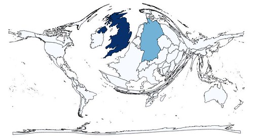 |
| Cartogram of countries based on number of pubs mapped on OpenStreetMap |
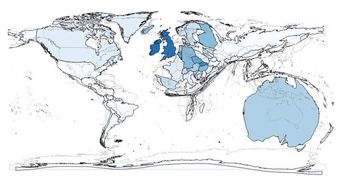 |
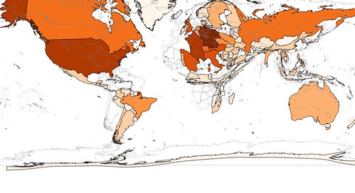
| Cartogram rejigged to use pub/unit population and a density function to generate the cartogram. Countries are coloured according to pub density. |
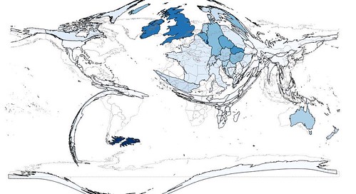 |
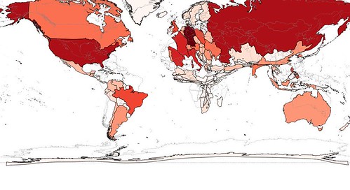
| As above, but cartogram generated using mass rather than density method. |
Working with pubs allowed me to work out the basic methodology. I then ran this through with a number of other subsets of POIs: Banks, Supermarkets, Restaurants, Post Offices & Pharmacies.
 |
| Supermarkets |
 |
| Restaurants |
 |
| Banks |
So far all this tells us is that OpenStreetMap has a long way to go before basic amenities are mapped reasonably comprehensively anywhere, let alone in China, India, and Africa. All the cartograms are maps of mapper activity not maps of things.
Marimekko (Mosaic) Plots
Another way I have wanted to look at this data is using a Marimekko plot.I wanted to do this before I gave a talk at SotM-Baltics, but there were too many complications. I therefore created a very rough approximation using values from country-specific instances of taginfo and Excel:
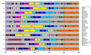 |
| Stacked-bar charts showing distribution of various retail categories by country with city of Nottingham (ng) at bottom. |
Instead I used SQL windowing functions to calculate the lower & upper bounds of the boxes and extracted that data into R. After a fair bit of experimentation with ggplot2, I found the geom_rect method most appropriate. Like a lot of R packages this is extremely rich in functionality some of which takes some effort to work out how to exploit. The examples below are a work in progress.
 |
| Retail Outlets on OSM in Africa |
 |
| Retail Outlets on OSM in Europe |
 |
| Retail Outlets on OSM in South America |
There are masses of improvements to this visualisation: better labelling (particularly of numeric values), showing smaller countries as 'other' or otherwise aggregated together. The main thing I did was to fiddle with the colour scheme in the hope that it is more readable by those who have colour-blindness. I used a suggested palette for colour-blind safe values and changed the brightness in steps for similar retail categories. I haven't yet had a chance to get feedback on this, but it did take time to evolve a custom palette for the values I used. I haven't really started using the plots for any kind of in-depth analysis (really I hope to be able to produce something like the Excel plot at the top on a more systematic basis), so this post is more about the realities of trying to create a (simple) global data set from OSM and then create visualisations with it.
I'll leave looking at the retail stuff in detail for a later post: the cartograms & plots are part of the toolset for exploring this data. I probably really want to look at retail POIs at something like city rather than country scale. This will require a bit more data wrangling (and probably some more gotchas to explore) before I'm able to do that.
I also would like to further tidy up the base dataset & get it so that I can update it from daily planet diffs. At that point it may become useful for others.
Could the legend from the 3 last pics be vertically inverted?
ReplyDeleteThe black values are on top of the graphic but they are at the bottom of the legend, for example.
I wasnt quite sure what you meant when I first read this. It was only when Harry asked if it could be picture of the week that I instantly realised you wanted the legend to be in the same order as the main plot. Fortunately R allows a simple reverse=TRUE options for legends, so here it is:.
ReplyDelete